
WillGaoLab
Follow the Market with Will
Introduction
Every Friday, I update the dashboard and record what I learned from that week’s market movement.
The dashboard focuses on three representative ETFs:
VOO— S&P 500QQQ— Nasdaq-100SMH— Semiconductor sector
Rather than predicting where the market will go next, my goal is to build a consistent framework for understanding market behavior over time.
Weekly Dashboard Latest
Week ending July 10, 2026
Current Snapshot Latest
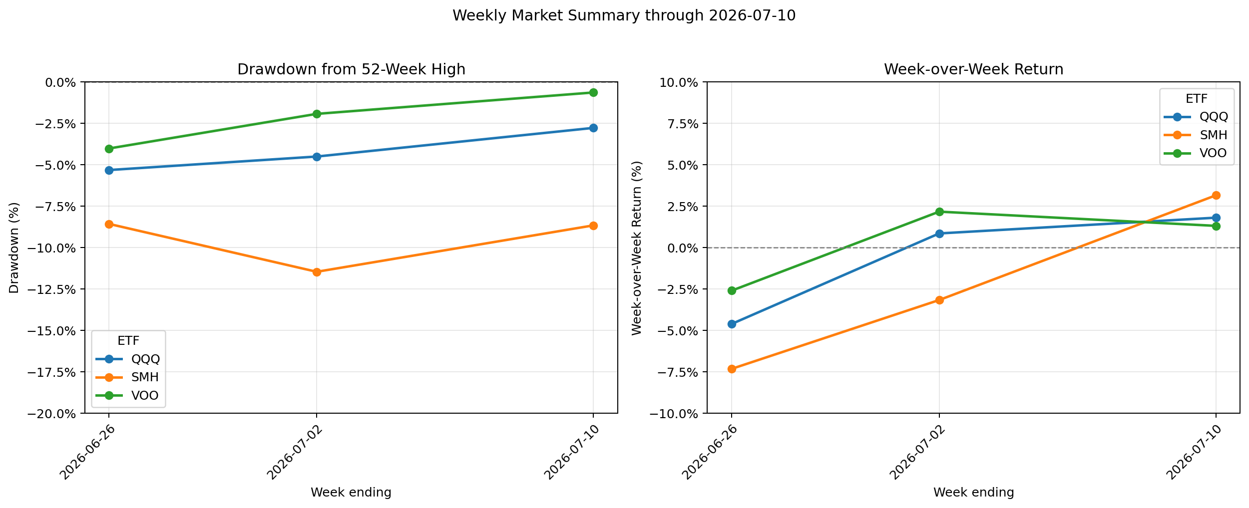
The chart above shows the historical trend. The table below summarizes the latest values for the current reporting week.
| ETF | Current Drawdown | This Week’s Return |
|---|---|---|
| VOO | -0.6% | +1.3% |
| QQQ | -2.8% | +1.8% |
| SMH | -8.7% | +3.2% |
My Notes This Week Latest
July 10, 2026
This week was the first time I learned how to interpret drawdown and week-over-week return together.
Before, I mostly focused on weekly returns. This week I realized that drawdown provides the long-term context that weekly performance alone cannot show.
VOO and QQQ have recovered most of their previous declines and remain close to their 52-week highs. The broader market appears to have regained most of its previous weakness.
SMH posted the strongest weekly rebound, but it remains well below its previous high. The semiconductor sector is still in the recovery phase, and it is too early to tell whether this recovery will continue.
Looking at these charts over time makes it much easier to identify trends. Instead of focusing on a single week’s gain or loss, I can see whether each ETF is moving toward or away from its previous high.
Previous Weekly Notes
Earlier weekly notes will appear here as the archive grows.
Reading the Dashboard
This dashboard combines two complementary metrics.
Drawdown
Drawdown measures how far an ETF’s closing price is below its highest closing price during the previous 52 weeks.
It answers a simple question:
Where is the market today relative to its recent high?
Values closer to 0% indicate stronger long-term positioning.
Week-over-Week Return
Week-over-week return measures the percentage change from the previous Friday’s closing price.
It answers a different question:
What happened over the past week?
Positive values indicate short-term strength, while negative values indicate short-term weakness.
Reading these two metrics together provides a more complete picture of market conditions than either metric alone.
Methodology
The dashboard is generated automatically by my open-source Market Tracker project.
Each week, the workflow:
- Downloads market data.
- Calculates standardized metrics.
- Validates the results.
- Generates the dashboard automatically.
Disclaimer
This page reflects my personal learning process and observations of the financial markets.
It is intended for educational purposes only and should not be interpreted as investment, financial, tax, legal, or trading advice.